




The previously-called Koramic2Engage has been an important contact centre structure for years, in Belgium and The Netherlands, with more than 5000 employees. Born bringing together autonomous entities (IPG, CallIT and In2com), it aimed at creating a unique offer in Europe thanks to authentic and personalized customer experiences.
Then, the time for scaling up came.
They looked for a new brand identity being recognizable and reliable, but also with a fresh and professional allure.
We supported them in each phase of this huge yet delicate challenge, always driven by the idea that a company merger is a great opportunity to go the distance. This project is one of the most complete and high-demanding we dealt with. And so, one of those we’re proud of.
THE CHALLENGE
How to bring a newly merged company to life with a consistent, cohesive, yet striking brand strategy and identity?
Straightforward answer:
Thanks to inspirational tailor-made brand-building process and communication.
THE BRAND IDENTITY: LET’S KICK IT OFF!
We believe in good analysis as a foundation for a solid company and a booster for creativity. So, we organized a first working phase in 3 steps to kick off brand identity.
That helped us to outline mission, vision, values, USPs, brand personality, archetype and tone of voice.
We included them in a broader plan, developing an internal and external communication strategy to pave the way to a more effective change.
THE FANTASTIC FOUR: CONCEPT, LOGO, BASELINE, DESIGN
Following the idea of evolution (not revolution!), the chosen name was WEngage.
We tailored the concept, the logo and the baseline. Then, it was time for design: we added our magic touch!
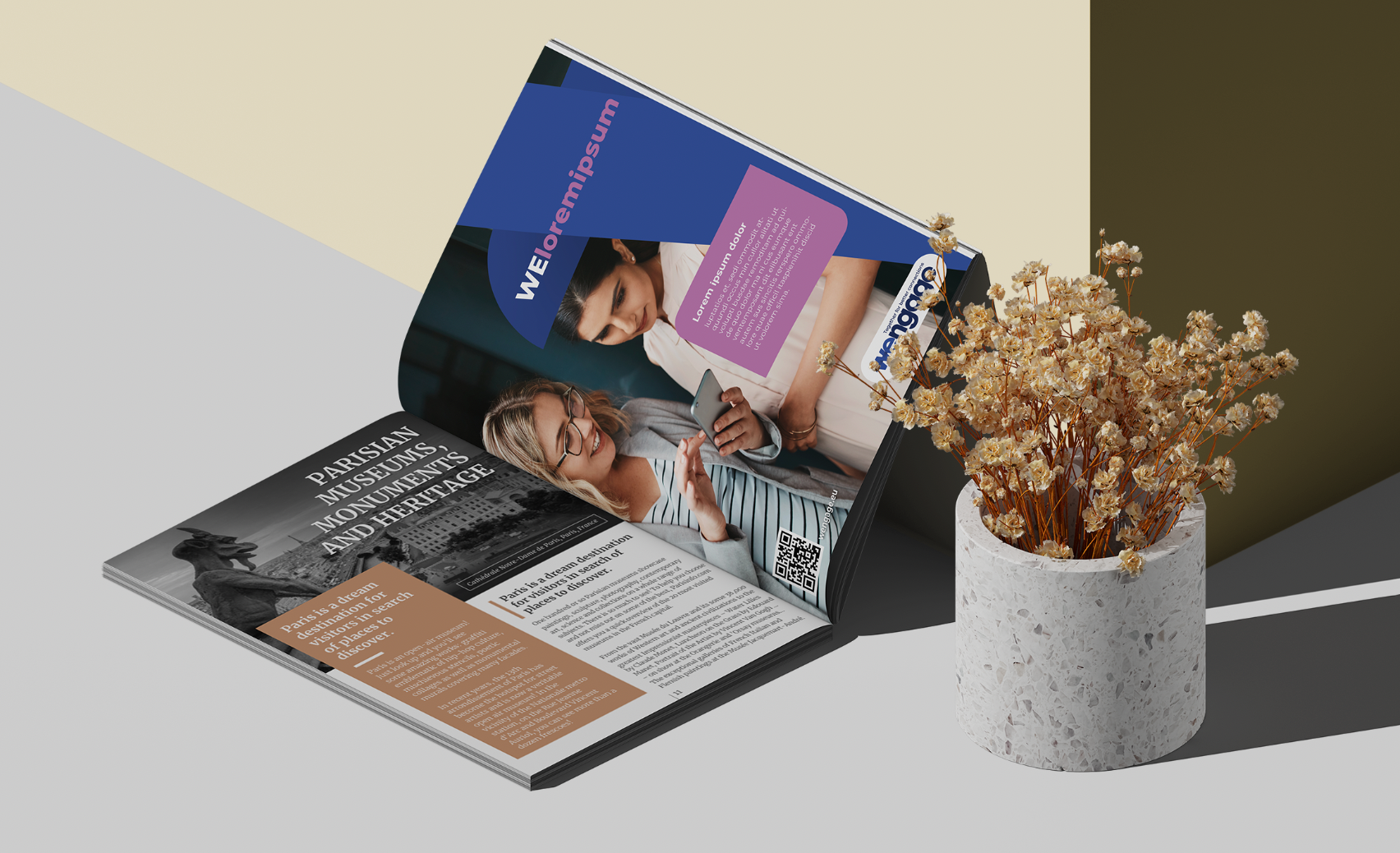
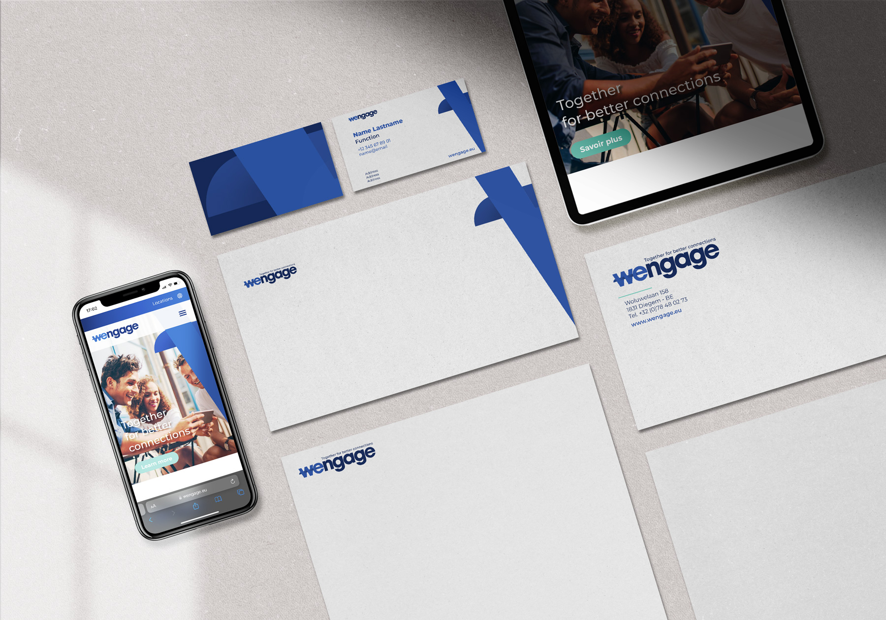
Colors, typefaces, graphic elements, visual and writing guidelines in three languages (English, French, Dutch) brought WEngage’s personality to life.
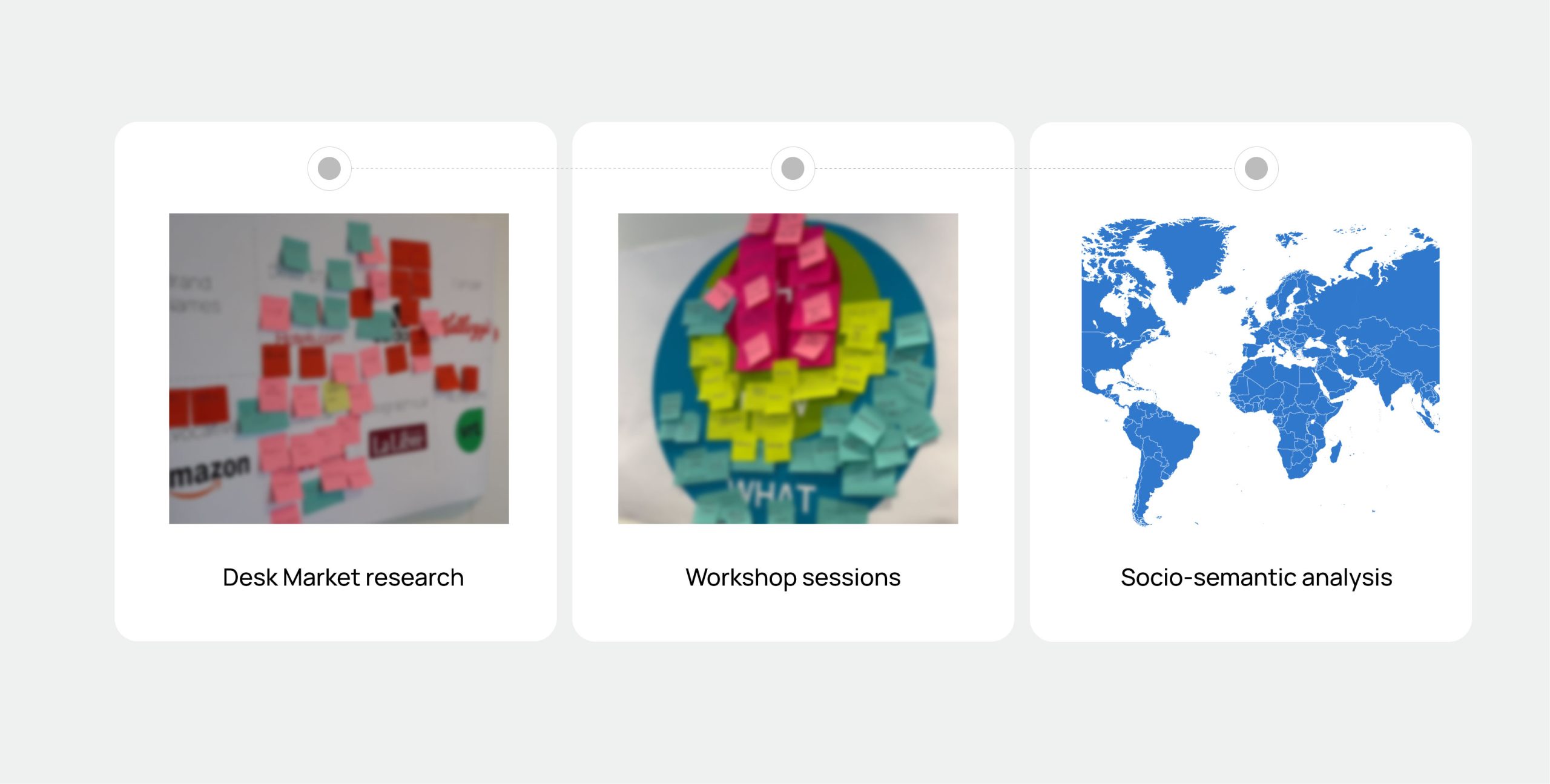
Name and concept. “WE” refers to the synergy between the old companies, but also between the WEngage and its partners. “Engage” is the link to Koramic2Engage. It means the company’s commitment to an enjoyable and inclusive work culture.
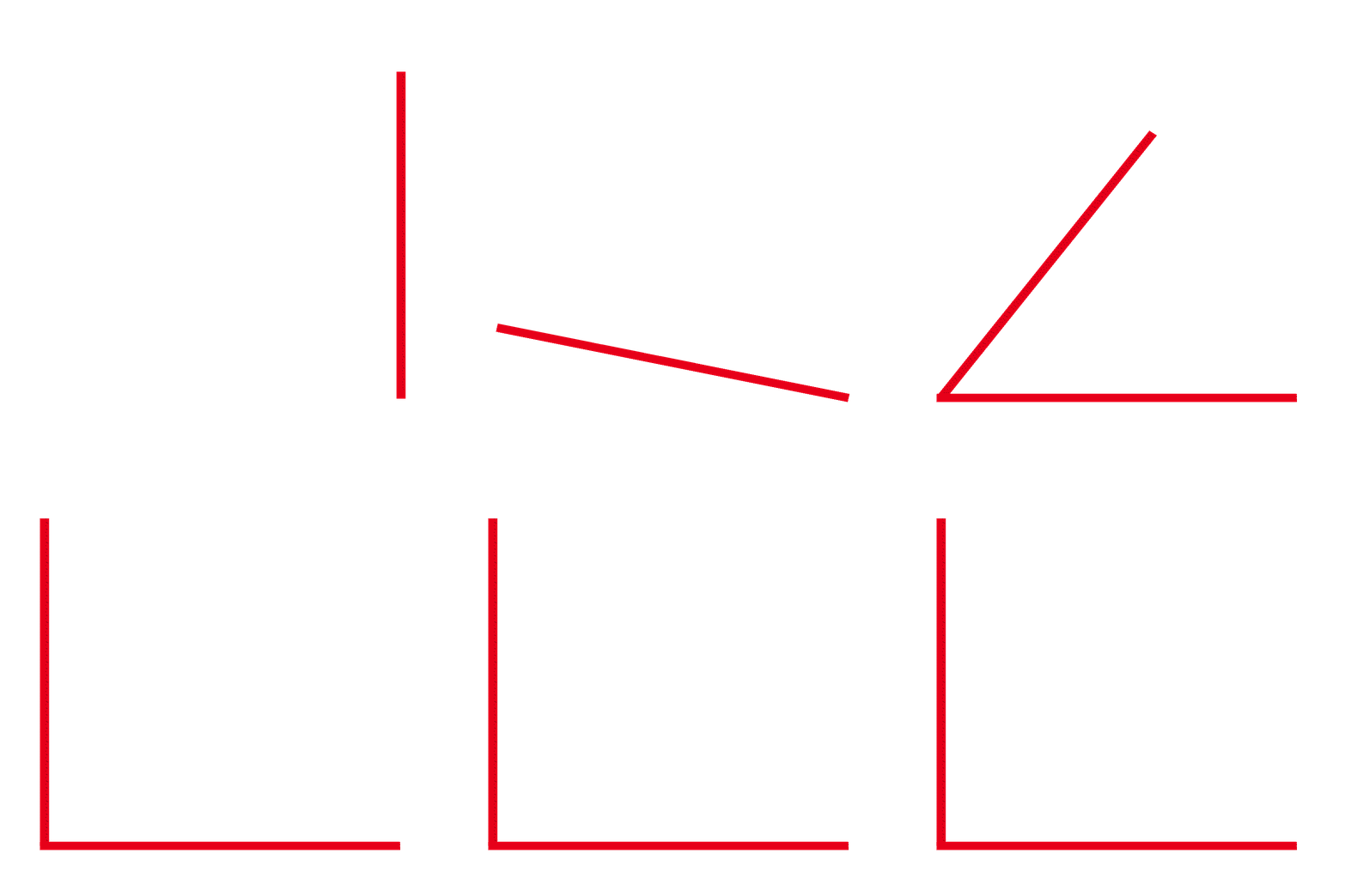
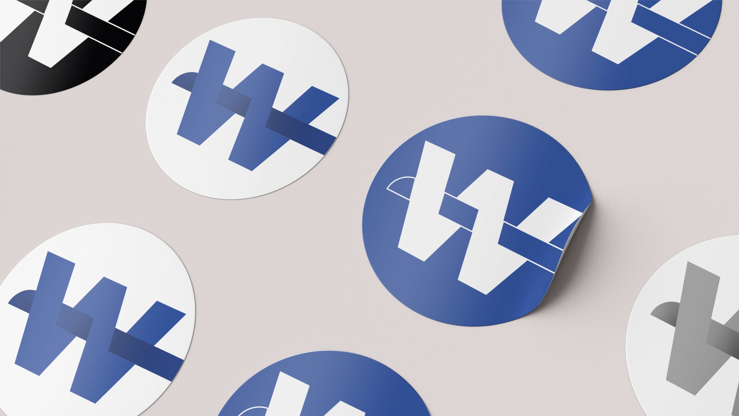
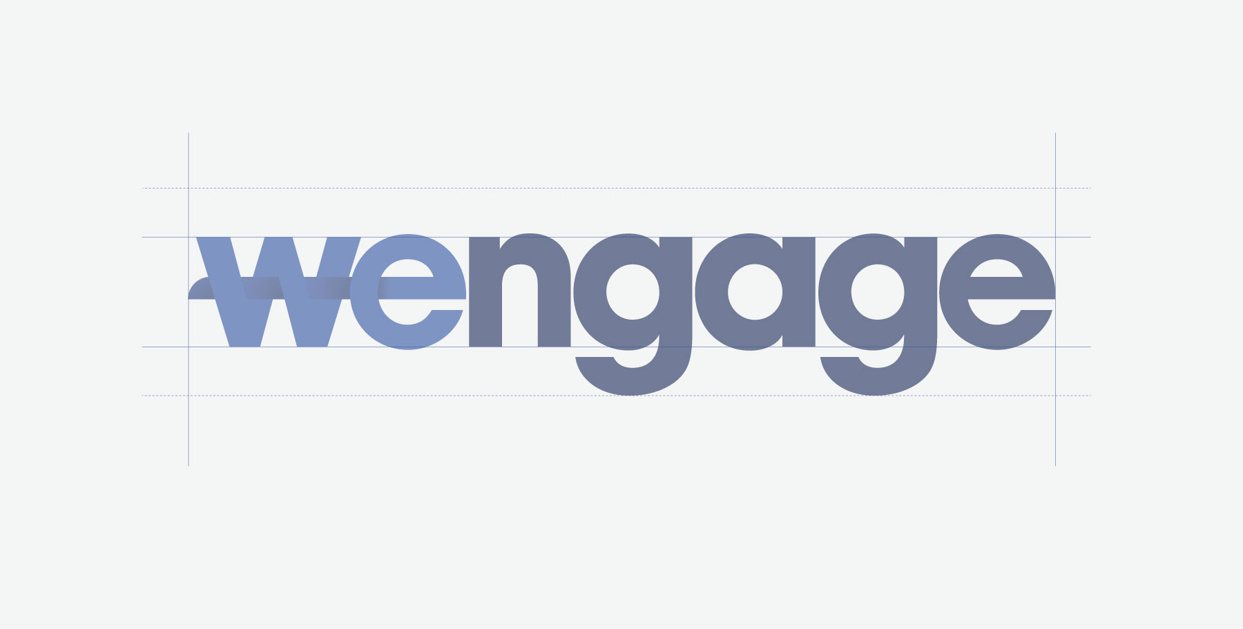
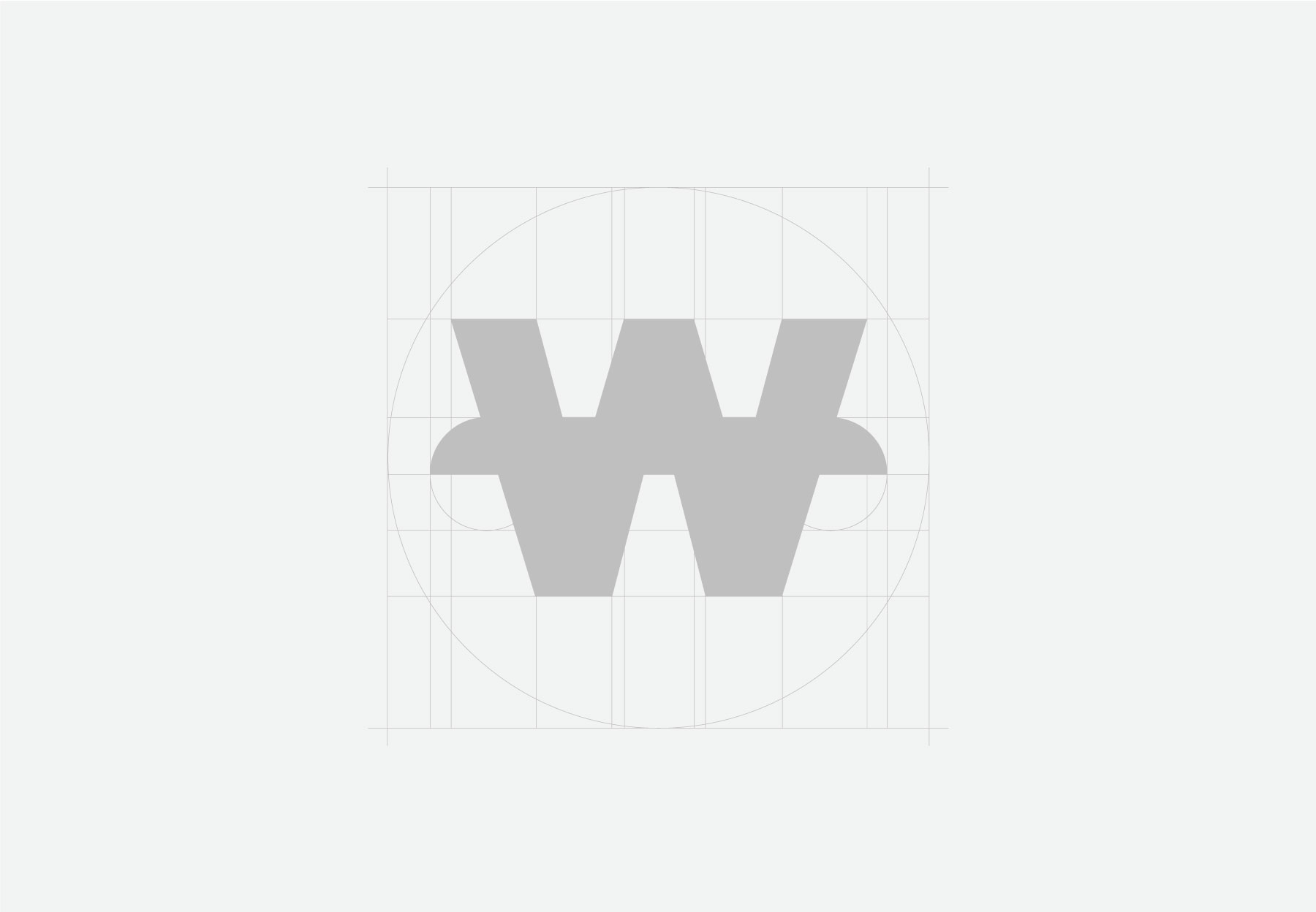
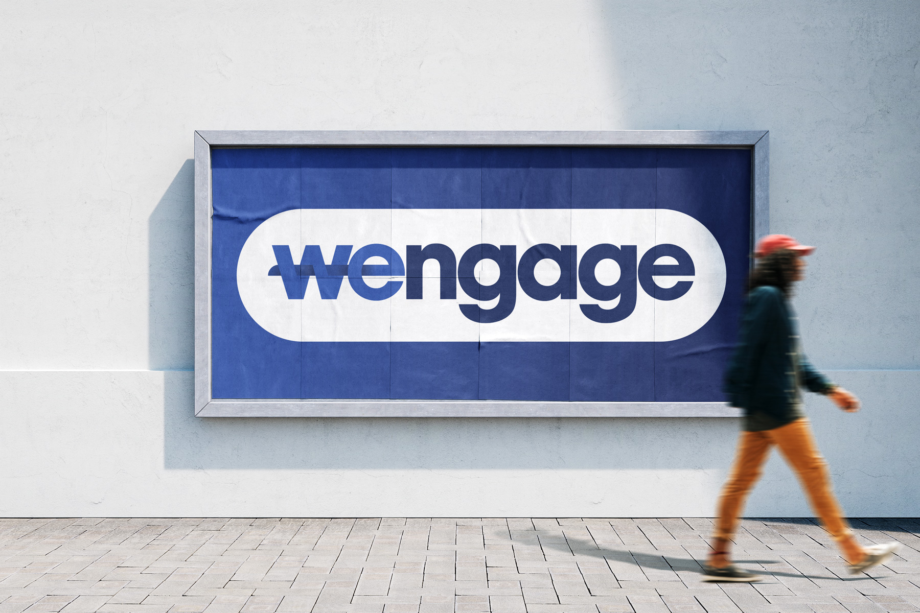
Logo. The design is captivating and contemporary. The hyphened ‘W’ represents connections. The blue colors stand for strength and integrity, while the roundness of the letters adds a touch of warmth.
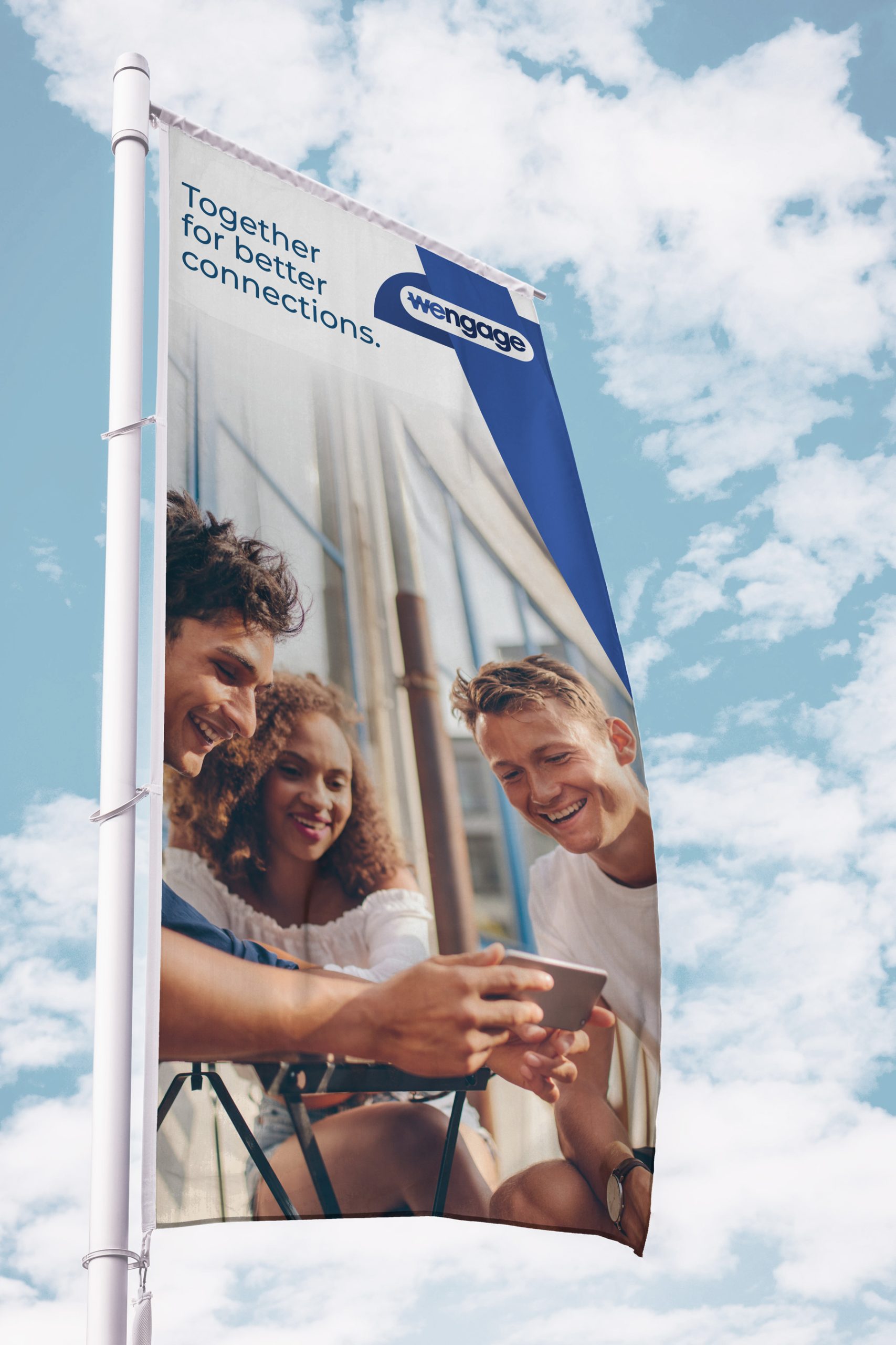
Baseline. The baseline goes straight to the point. It states the company’s mission and vision referring to the connection between people and technology.

THE DIGITAL ECOSYSTEM: CRUCIAL ASSETS YOU NEED
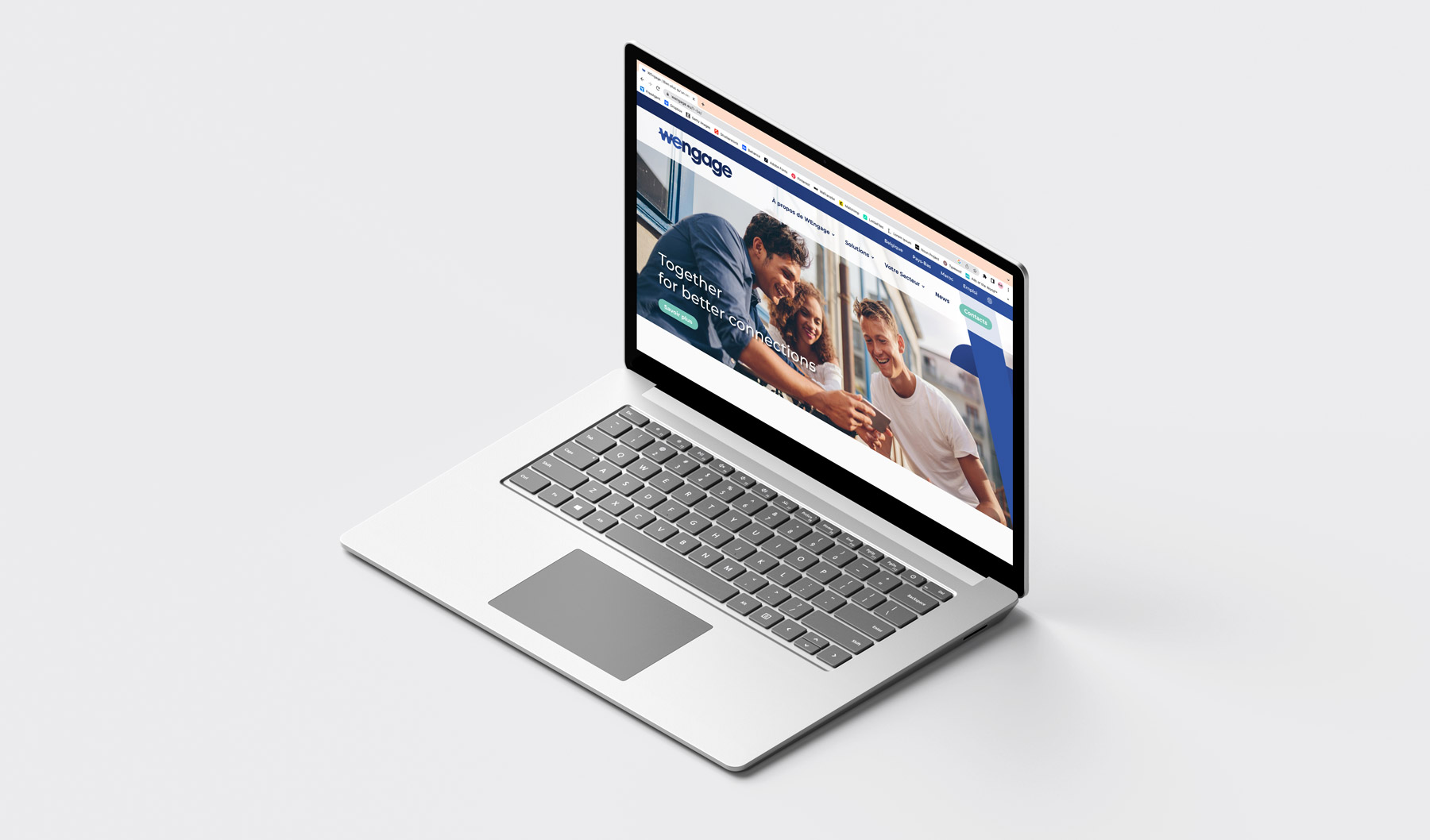
No business can reach major objectives without being online. Especially, when it comes to a newborn contact center that strive to become a beacon to many.
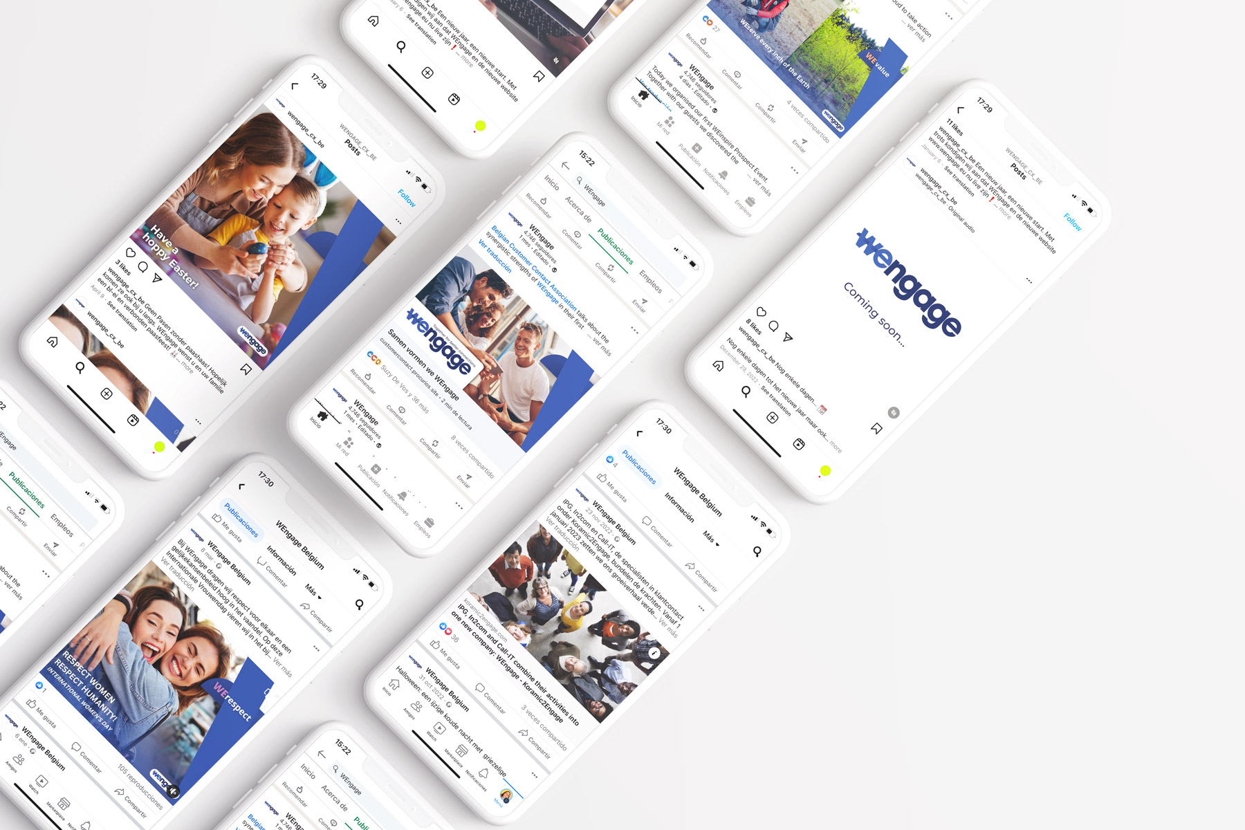
So, we implement a rich digital ecosystem, beneficial for external as well as internal communication.
Client
WEngage
Contacts
Glenn Franssens
Bert Vanmanshoven
Strategist
Damien Walckiers
Account & Workshop Lead
Suzy De Vos
Rik Peetermans
Creative Content Manager
Livia Corbelli
Creative
Margaux Goethals
Copywriter
Tony Geudens
Gilles De Bruyère
Graphic designer
Danielle Verlinden
Margaux Goethals
Motion Designer
Tim Tassent
Data Analyst
Rik Peetermans
Web Developer
Dieter Jeanty